Renegade Public Forums
C&C: Renegade --> Dying since 2003™, resurrected in 2024!
Home » General Discussions » General Discussion » OT: Web Layouts
OT: Web Layouts [message #63109] Thu, 22 January 2004 00:55 Go to next message
Dante
Messages: 1039
Registered: February 2003
Karma: 0
General (1 Star)
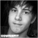
Heya guys, as some of you may know (and others not know) my new business is opening its flood gates in about a week or so and i may have to start doing "some" of my own gfx work, not all, but selected stuff.

Well, over the last couple of weeks I have done the crash coarse of photoshop and probably tried every tutorial on the web.

Here is a recent layout I am working on, and would like to get some honest opinions, as well as some suggestions as what i should add/edit/remove/whatever.

Sorry to post up here, but its one of the busiest boards I visit, and you guys surf a lot of web.

p.s. The big black circle is for a logo i have yet to scan and get into photoshop, so that is just a placeholder till i get it imported.

http://www.renevo.com/beansmusic/beans_layout_v2.jpg

Thanks Smile


OT: Web Layouts [message #63110] Thu, 22 January 2004 01:05 Go to previous messageGo to next message
Sk8rRIMuk is currently offline  Sk8rRIMuk
Messages: 1019
Registered: February 2003
Location: Blackheath, England, Unit...
Karma: 0
General (1 Star)

I looks good seeing as you just had acrash course in photoshop Smile

The boat is especially well done, it adds a certain feel of proffesionalism to the layout.

Although I am not too fond of the emboss effect in this context, I suppose it is too hard for my taste, or that may just be me.

Again the boxes look good and the three lines add a break to the flow of the page in a positive manner.

Blue, black & white are always tricky to get right as well, it seems to work nicely here with a mild exception of the font on the buttons (amateurish) and at the top of the page, it works but it just needs something...

I think that the placing and style of the logo will be crucial in rounding off the design of the site.

Altogether not bad at all Razz


WOL Nick - Sk8rRIMuk

http://www.bwstudios.co.uk/private/sk8rrimuk.jpg

The one and only original "spammander"!

[Updated on: Thu, 22 January 2004 11:06]

Report message to a moderator

OT: Web Layouts [message #63112] Thu, 22 January 2004 01:25 Go to previous messageGo to next message
England is currently offline  England
Messages: 618
Registered: February 2003
Location: High Wycombe, England
Karma: 0
Colonel
Honestly, when i first glanced at it i didn't like it, it seemed blurry, then i relised i am still hungova!

Looked at it again, and i like it, only thing that id suggest would be checking out how those 'text blocks' look together rather then three seperate.

Overall, pretty Smile


In the end it doesn't matter if you are who you say you are. You will still mean nothing to me.

When i have kids, everytime i drive past a fast food restaurant, im gonna punch my kid in the face, then they'll never wanna come..
OT: Web Layouts [message #63114] Thu, 22 January 2004 02:09 Go to previous messageGo to next message
Deafwasp is currently offline  Deafwasp
Messages: 555
Registered: February 2003
Karma: 0
Colonel
I like and respect Dante a lot. But you need a LOT of practice.

My only suggestion is try and play around with each of the photoshop features and abilities and just try different effects. Make pictures and designs for your own love of the art. After a while you will develope some real skill, as long as your persistant and don't give up on things.

Now my honest opinion of your design... It is pretty amaturish and mickey mouse. It is very bland and un immaginitive. But as you said, you are a newbie to photoshop. So all things concidered, it is a excellent start to your graphical design career.

I am not sure what your business is, but I would like to know more.

Keep it up Dante.
OT: Web Layouts [message #63156] Thu, 22 January 2004 13:29 Go to previous messageGo to next message
cowmisfit is currently offline  cowmisfit
Messages: 2035
Registered: May 2003
Karma: 0
General (2 Stars)
looks pretty good for just starting out with photoshop. Are you starting music buisness or is that just words you put there??? Whats the link too your new business??

http://img299.echo.cx/img299/7085/philly1ge.jpg
OT: Web Layouts [message #63162] Thu, 22 January 2004 13:52 Go to previous messageGo to next message
Jaspah is currently offline  Jaspah
Messages: 1478
Registered: July 2003
Location: Syracuse, New York
Karma: 0
General (1 Star)
Someone has been visiting www.good-tutorials.com. Razz
OT: Web Layouts [message #63167] Thu, 22 January 2004 14:28 Go to previous messageGo to next message
Dante
Messages: 1039
Registered: February 2003
Karma: 0
General (1 Star)
actually, that isn't one site i visited, i was mostly on pslover.com, eyeballdesign.com, n-sane.net, pegassisweb.com, and a few others.

OT: Web Layouts [message #63188] Thu, 22 January 2004 15:40 Go to previous messageGo to next message
General Havoc is currently offline  General Havoc
Messages: 1564
Registered: February 2003
Location: Birmingham, England, Unit...
Karma: 0
General (1 Star)
Doesn't look too bad. Just the font that I think is a bit out of place, sort of blends together, needs more definition of the characters I'd say. I take it that it's a web design business? You having skills in ASP and that, just figured.

I've never been good at the creative/design side of things, so I stick to learning the programming behind things.

Not bad though, If you develop it more, it could look pretty good.


Visit my website at http://renhelp.laeubi-soft.de powered by laeubi.de
"SHUT UP AND MOD" - Dante
"ACK is the Simon Cowell of modding" - Ultron10
Scripts.dll Debugger, Map Scripter and Tutorial writer

Computer Science Bsc
Aston University in Birmingham, UK
OT: Web Layouts [message #63195] Thu, 22 January 2004 16:26 Go to previous messageGo to next message
IRON FART
Messages: 1989
Registered: September 2003
Location: LOS ANGELES
Karma: 0
General (1 Star)
The shadows on those stripes, and on the blue curve where it says "Bean" make the object look odd. You need to play around with those esp. in blending options.

Sign up on http://tutorialforums.com/ They have thousands or members. Not trying to draw away traffic or anything lol. Those forums revolve around Graphics mainly and are in association with some other sites that provide tutorials etc.

Visit http://www.spoono.com and http://robouk.mchost.com
You can easily add an aqua effect to the blue curve at the top with a tut on robouk which i used to use alot because it was so quick.

There is alot out there to learn, and it is a BIG community.
OT: Web Layouts [message #63272] Fri, 23 January 2004 01:55 Go to previous messageGo to next message
Dante
Messages: 1039
Registered: February 2003
Karma: 0
General (1 Star)
thanks guys

OT: Web Layouts [message #63273] Fri, 23 January 2004 02:07 Go to previous messageGo to next message
Blazer is currently offline  Blazer
Messages: 3322
Registered: February 2003
Location: Phoenix, AZ
Karma: 0
General (3 Stars)
Administrator/General

http://www.tutorialzed.com
OT: Web Layouts [message #63305] Fri, 23 January 2004 08:54 Go to previous message
npsmith82 is currently offline  npsmith82
Messages: 525
Registered: February 2003
Location: England, UK
Karma: 0
Colonel
Blazer

www.tutorialzed.com

Or even, http://www.tutorialized.com Razz


WOL: npsmith82

For RenAutoComplete, RenSkirmish, RenBuddyList and RenWOLstatus please visit (IE) TheCodeSmith.com
Previous Topic: JTeKSvr06
Next Topic: Simple reminder.
Goto Forum:


Current Time: Thu May 23 11:14:04 MST 2024

Total time taken to generate the page: 1.36684 seconds